This pic isn't just a confession, nor an excuse to tantalise my readers:
 It illustrates a few of my favourite design principles:
- contrasts: dark and light, neutrals and brights
- complementary colours (or nearly)--my favourite, blue, set off with a touch of yellow
- off-centre--I like it better than symmetrical
- and more is more--one of my favourite cook books calls it "flavour layering". So, if choc is good, double choc is better and triple choc is better again. That makes triple choc with a chocolate egg on top just great!


 I stopped for a while to take these photos and was amused to see several groups of tourist stop beside me and peer over the rail to see what they might be missing out on! In my quilting classes over the past few weeks I've been challenging the students to think about the ways colours interact. I'm noticing how different the fern trees look here with their different backgrounds. I'm not sure how I might use that observation, but there it is.


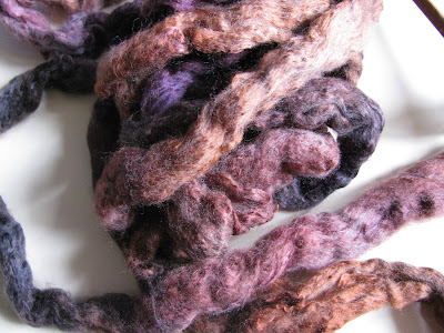
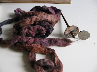
 This is my multi-marle approach to colour mixing. Here's how it looks on the bobbin today.
 It's quite high twist, so I'm thinking of plying it back onto a fine commercial wool yarn. I hope the texture as well as the colour combination will pick up some of my feeling about the photo.


